EL RANCHITO PRESENTS THE NEW BRAND
Our company has experienced significant growth in recent years. We have strengthened our market presence as part of a globally operating group of VFX studios. However, this expansion has also offered challenges in terms of identity alignment and communication. We have therefore embraced a fully-fledged rebranding process. Our aim is to ensure a corporate identity that reflects our evolution as a company and reflects our core values.
As a key feature of this corporate identity, we developed a logo that recalls the founding values of El Ranchito with its characteristic "R", which will be the visual presentation of our new identity. This new identity symbolizes our position within the group and our ability to deliver cutting-edge creative and visual solutions.
Reflecting our original brand image, we have preserved similar typography, in line with our new style but maintaining the core and roots of our origin, reflecting our evolution and adaptation to our current environment.

Regarding the colour palette, we made a significant change. The use of bright and warm orange is part of our re-branding strategy. This colour represents the sun, light, and warmth, inspired by the brightness, strength and energy that defines us as a company. Meanwhile, we have kept our original colours, black and white, to preserve our heritage, origin and our integration with the other brands of the group.

This new image, with a warmer and more modern design, is just the first step. As we move forward in this process, we will also update the other elements of our corporate identity, such as marketing materials and internal communication. All of this is aimed at representing the unity and strength of our team, which are foundational values of our company.
More
-
03.13.2024
Introducing Digital Matte Paint Department (DMP)⚡️
-
02.12.2024
Tenth Goya for El Ranchito
-
01.23.2024
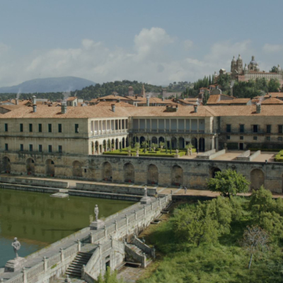
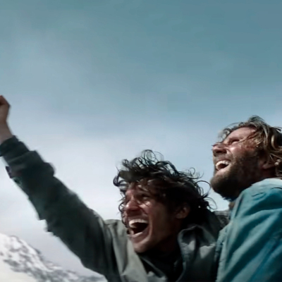
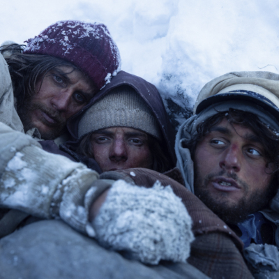
Society of The Snow nominated for two Oscars